Welcome, fellow design enthusiasts! It’s a joy to delve into a topic close to my heart and so fundamental to creating spaces we love: the psychology of color in furniture design. It’s fascinating how the hues we choose for our sofas, chairs, and tables can do so much more than just fill a space. They can profoundly influence our mood, our energy, and the overall atmosphere of our homes. In my years of exploring and experimenting with interiors, I’ve learned that understanding this colorful language is key to crafting environments that truly resonate with us.
The silent language of hues in our living spaces
Color psychology, at its core, explores how different shades impact human behavior and emotions. It’s a concept that designers, myself included, have leaned on for ages, recognizing that color is a powerful, non-verbal communicator. When we talk about interior design, and specifically furniture, we’re talking about significant visual and emotional anchors in a room. As Chitkara University’s guide on color psychology in interior design points out, understanding these effects allows us to create spaces that are not just aesthetically pleasing but also emotionally supportive. Colors are often broadly categorized into warm tones like reds, oranges, and yellows, which tend to evoke feelings of energy, warmth, and coziness, and cool tones like blues, greens, and purples, which are generally associated with calm, serenity, and relaxation. Think about the immediate feeling a vibrant red armchair injects versus the soothing presence of a pale blue sofa. The difference is palpable, isn’t it? Understanding this can lead to creating harmony between the furniture and walls in a truly impactful way.
A journey through the spectrum specific colors in furniture
Choosing the right color for your furniture is about more than just matching your curtains. It’s about curating an experience. Each color family brings its own unique personality to a piece of furniture and, by extension, to your room. Let’s explore some of these key players and how they might influence your next furniture selection.
The energetic embrace reds oranges and yellows
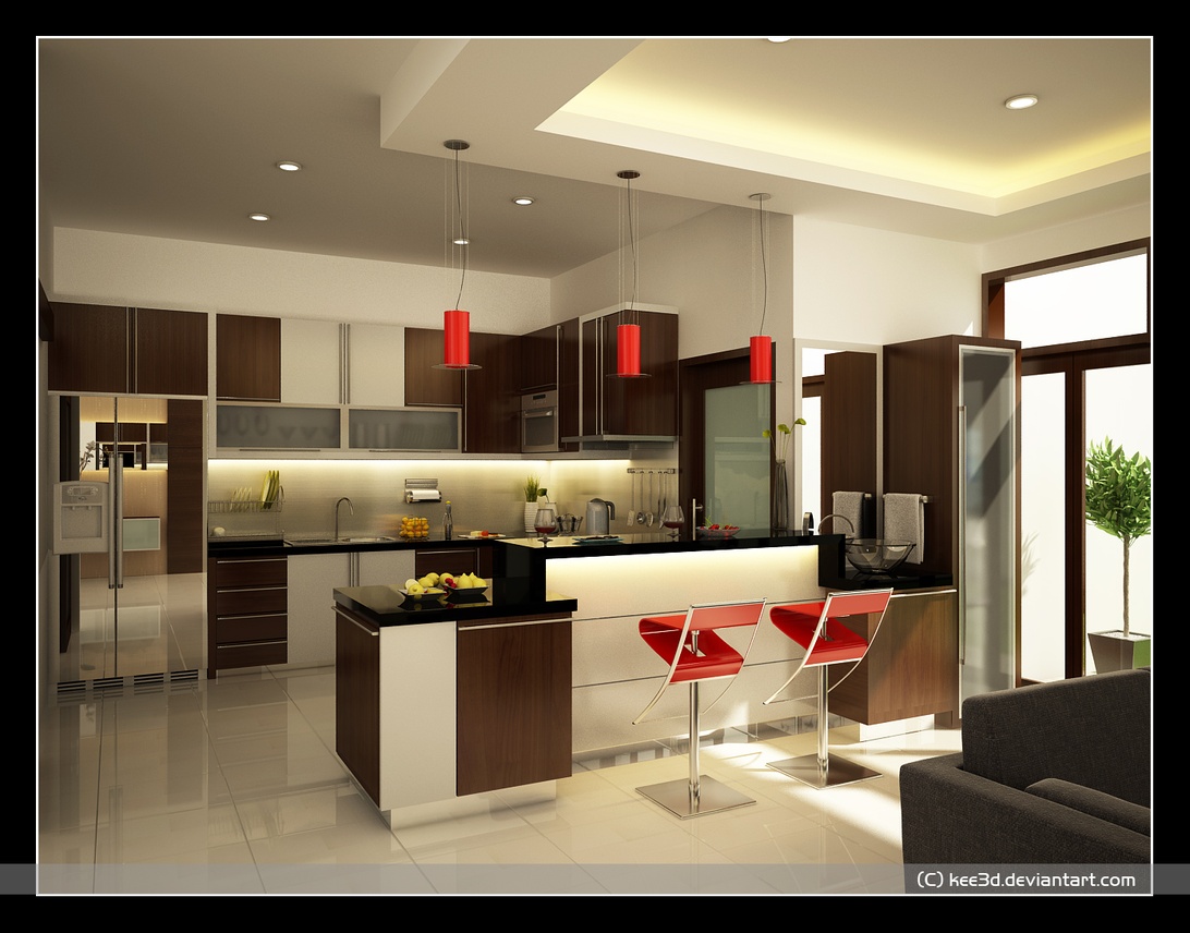
Red is undeniably a color of power and passion. A splash of red in your furniture, perhaps a statement armchair or bold dining chairs, can instantly draw the eye and inject a dose of energy into a space. It’s associated with excitement and can stimulate conversation, making it a tempting choice for social areas. However, as noted in various sources like EMFURN’s blog on furniture color psychology, too much red can feel overwhelming, so I often recommend using it as an accent or balancing it with more neutral tones. Imagine a contemporary kitchen, like the one pictured, with sleek white cabinets, suddenly brought to life with vibrant red bar stools and matching pendant lights. It”s a classic way to add a ‘wow’ factor without going overboard, demonstrating how colorful furniture pieces can create visual impact in an otherwise neutral space.
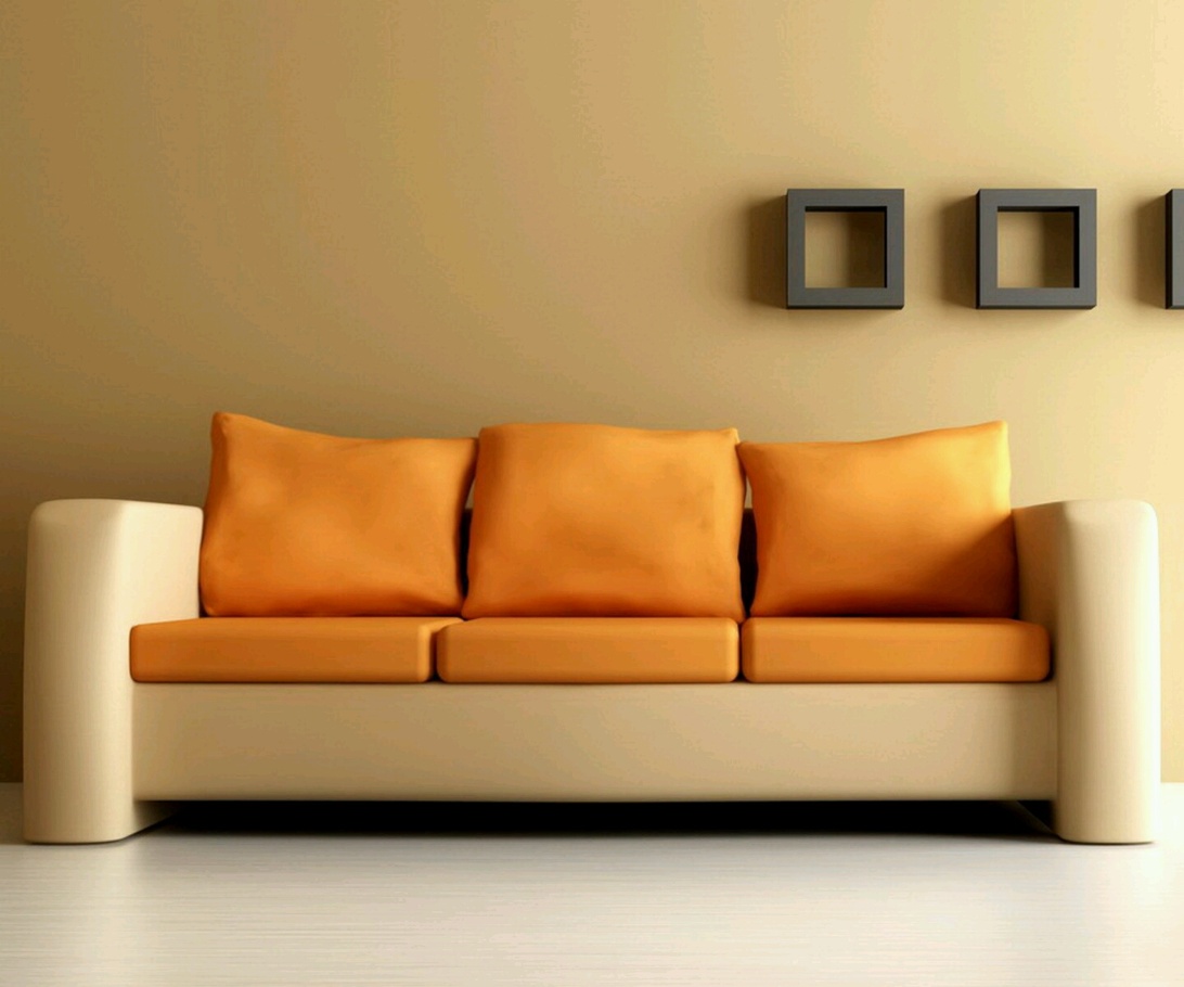
Orange, a delightful blend of red’s energy and yellow’s cheerfulness, is all about warmth, creativity, and social interaction. I find that orange furniture, whether it’s a plush ottoman or a set of dining chairs, can create a very welcoming and friendly atmosphere. According to The Design Sheppard’s insights on using orange, this color can stimulate appetite and conversation, making it a fantastic choice for dining areas or family rooms. However, it’s worth noting that vibrant orange isn’t typically seen as a relaxing color, so I’d use it more sparingly in spaces dedicated to rest. Milder shades like peach or terracotta, on the other hand, can bring a softer warmth. A contemporary sofa, such as the one shown with its striking orange cushions against a cream frame, is a great way to introduce this color’s vibrancy and create visual interest in an otherwise neutral space.
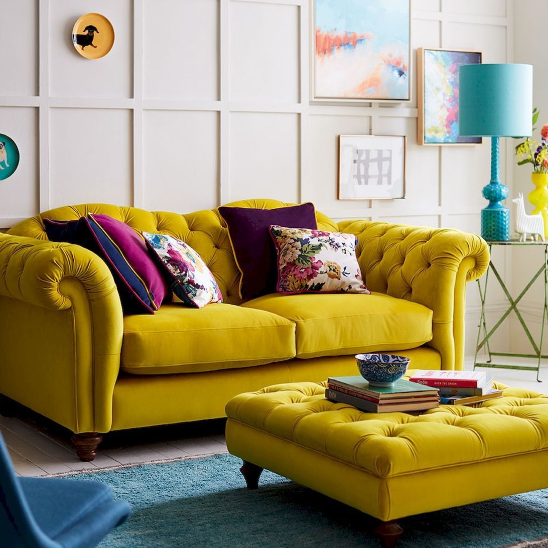
Yellow is the color of sunshine, exuding happiness, optimism, and positivity. Furniture in shades of yellow can instantly brighten a room and lift spirits. I’ve often recommended yellow accents, like a cheerful yellow side table or sunny yellow cushions, to bring warmth and energy, especially in kitchens or breakfast nooks where you want to start the day on a positive note. As Homes and Gardens discusses in their color psychology lessons, yellow is one of the most uplifting colors. While a full yellow sofa might be a bold move for some, even smaller pieces can make a significant impact. The luxurious living room depicted, with its bright yellow Chesterfield sofa, matching ottoman, and colorful accents, exemplifies how bold color choices and classic furniture silhouettes can create a sophisticated yet vibrant style.
However, much like red, very intense yellows used extensively can sometimes cause feelings of agitation, so balance is key. Accessorizing with beautiful picture frames can also help in balancing bold color choices.
The tranquil touch blues greens and purples
Blue is widely recognized for its calming and serene qualities. It’s a color I frequently turn to when designing spaces for relaxation, like bedrooms or quiet reading corners. Furniture in shades of blue, from the softest pastels to deep indigos, can promote a sense of peace and tranquility. Verywell Mind’s exploration of color psychology highlights blue’s ability to evoke calm, and some studies even suggest it can lower heart rate and reduce anxiety. A study mentioned by PMC on interior color in a university residence hall found a preference for blue interiors, associating it with a calm state of mind and easier studying. This makes blue furniture an excellent choice for home offices or study areas too, where focus is paramount.
Green, the quintessential color of nature, brings with it feelings of harmony, balance, and renewal. Green furniture can create a refreshing and restorative atmosphere, making it wonderfully versatile for almost any room. It’s particularly effective in spaces where stress reduction is a priority. As Asghar Furniture’s blog explains, green is associated with grounding and calm. Whether it’s an olive green armchair or a sage green cabinet, these pieces can help bring the soothing qualities of the outdoors in. In my experience, green is also quite restful for the eyes, which is a lovely bonus.
Purple has long been associated with luxury, creativity, and even a touch of spirituality. Furniture in shades of purple, from delicate lavenders to rich plums, can add an element of sophistication and drama to a space. Lighter purples can create an elegant and serene ambiance, while deeper shades can feel more opulent and intriguing. The Bonnie Home’s article on color psychology in furniture notes purple’s connection to creativity, making it an interesting choice for artistic studios or spaces where you want to inspire a bit of out-of-the-box thinking. I find that a velvet purple chaise lounge or even just some plush purple cushions can instantly elevate a room’s sense of style.
The grounding grace neutrals in furniture design
Neutral colors, such as whites, beiges, grays, and browns, are the unsung heroes of furniture design. They offer incredible versatility and create a sense of balance, often serving as a calm backdrop that allows other design elements to shine. Furniture in neutral tones is a staple in minimalist and contemporary designs, but it’s equally at home in more traditional or eclectic settings. As Decorilla’s piece on interior design color psychology suggests, neutrals like gray and white often convey a sense of calm and harmony. A beige linen sofa, a sleek gray console, or a classic wooden dining table in a rich brown can provide a timeless foundation for your decor. They also allow for wonderful flexibility. You can easily change the mood of the room with colorful accessories like vibrant cushions or even strategically placed round rugs that rock the interior world if your main furniture pieces are neutral. Brown, in particular, as found in many wooden furniture pieces, brings warmth, stability, and an earthy comfort to a space.
Beyond the shade texture light and personal resonance
While the hue itself is significant, it’s not the only factor at play. The saturation (intensity) and lightness (value) of a color dramatically alter its psychological impact. For instance, a pale, desaturated blue will feel very different from a deep, vibrant cobalt. Furthermore, our personal experiences and cultural backgrounds shape our individual responses to color. What one person finds uplifting, another might find unsettling. This is why, as much as I adore sharing these general principles, I always encourage people to listen to their own instincts. An interesting framework I’ve come across, detailed by Sophie Robinson in her explanation of color psychology for interiors, links personality types to specific ‘seasonal’ color palettes. For example, a ‘Spring’ personality, often characterized by optimism and creativity, might gravitate towards light, clear, and cheerful colors like soft yellows, fresh greens, and sky blues in their furniture, favoring modern and airy designs. In contrast, an ‘Autumn’ personality, deeply connected to nature and passion, might prefer a palette of warm, intense, earthy tones such as terracotta, mustard yellow, and deep olive green, often found in robust, textured furniture with natural materials. These are fascinating ways to think about what colors might naturally resonate with you.
Practical application is where the magic truly happens. Consider the function of the room: a bedroom benefits from calming colors, while a playroom can handle more vibrant, energetic hues. As Color Meanings discusses, it’s about matching the color’s psychological effect to the room’s purpose. Lighting is another crucial element. Natural and artificial light can significantly alter how a color appears and feels. A color that looks perfect in the showroom might look entirely different in your home. And don’t forget texture! A glossy red will have a different energy than a matte, velvety red. Inspired Rooms highlights how texture and color in furniture design work together. Ultimately, the goal is to create a harmonious balance. If you opt for a boldly colored sofa, perhaps pair it with neutral walls or accessories to avoid overwhelming the space. In office environments, many organizations are discovering the significant HR intranet benefits available for streamlining communication and boosting employee engagement, which directly contributes to a more productive and positive work atmosphere. Similarly, as All Business Systems points out, thoughtful color choices in office furniture can also significantly impact productivity and mood, with blues and greens fostering focus and calm, and yellows or reds adding energy to collaborative zones. This principle extends to children’s rooms as well, where, as Resident.com suggests, blues and greens can be calming, while reds and yellows should be used as accents to avoid overstimulation.
Composing your homes color story with confidence
Choosing furniture is such an exciting part of creating a home, and color plays an undeniably central role in that process. It’s more than just aesthetics. It’s about crafting spaces that support our well-being, reflect our personalities, and tell our unique stories. By understanding the subtle (and not-so-subtle) ways colors influence us, we can make more intentional choices that lead to environments that not only look beautiful but also feel deeply right. Don’t be afraid to experiment! Sometimes the most unexpected color choice can bring the most joy. Whether you’re drawn to the tranquil embrace of blues and greens, the vibrant energy of reds and yellows, or the timeless appeal of neutrals, remember that your home is your canvas. The psychology of color is a wonderful guide, but your personal connection to a hue is what will ultimately make your furniture, and your home, truly sing. As Bluespace Interiors discusses for office settings, applying these principles can transform a space, and the same is true for our homes. For instance, understanding color can even influence choices when selecting the best furniture for recovery after breast implants, prioritizing comfort and serenity. Happy decorating!